| home |
| faq |
| sitemap |
| contact |
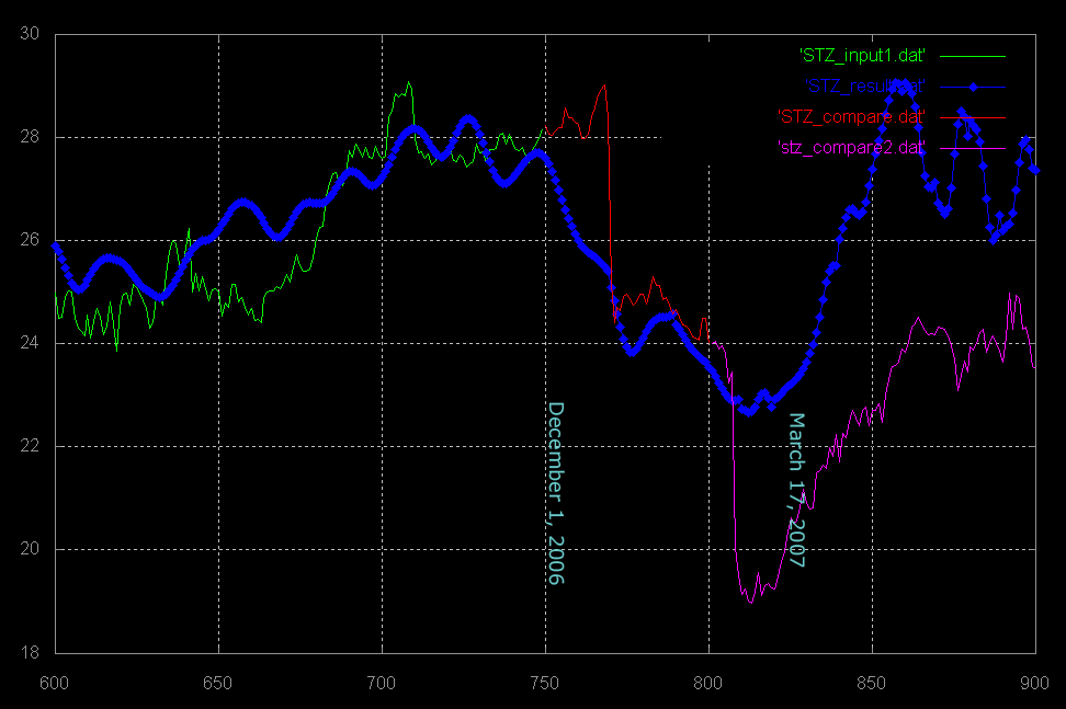
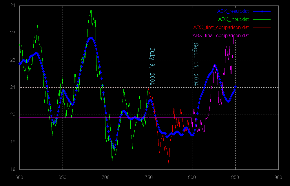
| The thin lines are the actual closing price data. | ||
| The thick blue lines are the output results of the artificial intelligence. | ||
| The thin green lines make up the only data that was shown to the AI. These data points are needed to train the AI. | ||
| The red and purple lines are the actual price data, plotted here to compare how well the AI was able to predict the movement of the magnitude. |
 |
 |